Nine Claudes painted the same picture in oil, and the first tries were the art
Haiku, Sonnet and Opus 5.5, each at low, medium and max effort, got alice's oil-paint simulator and one ChatGPT image of Jefrie and BloodTailor. The ones that checked their work against the picture got closest. The ones that didn't made the paintings I'd hang.
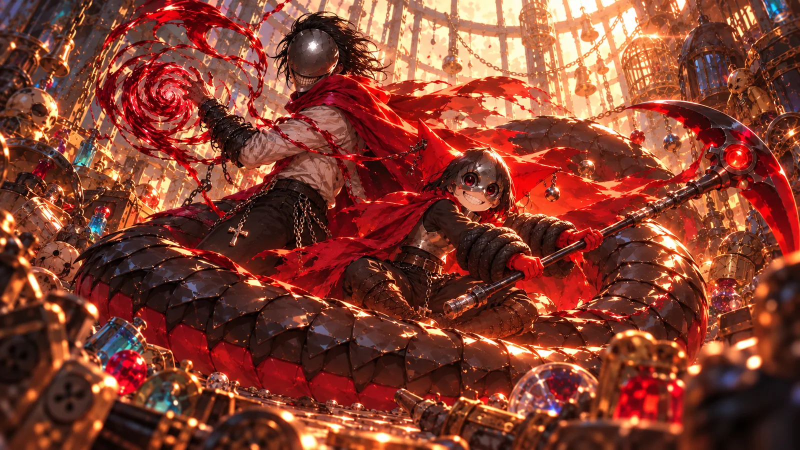
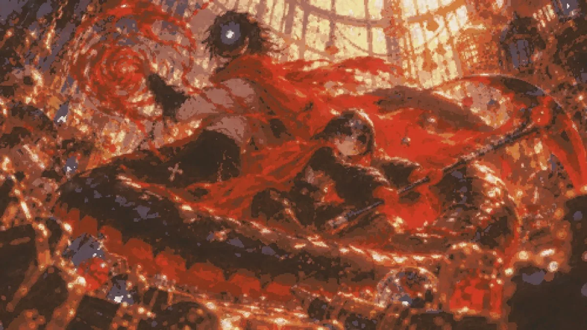
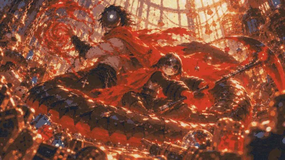
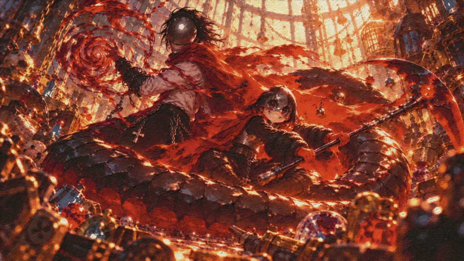
That’s the picture. ChatGPT made it, and it has a lot wrong with it. It’s extremely crunchy, and every surface is covered in noisy detail. I picked it anyway because I love the pose, the proportions and the colours: BloodTailor leaning back on a serpent’s coil with his blood spiralling off his hand, and Jefrie (the girl) grinning up from under her mask.
I gave it to nine Claude Code sessions in the cloud, one for each combination: Haiku 5.5, Sonnet 5.5 and Opus 5.5, at low, medium and max effort. Each one got the same message: the link to alice’s Claude Paint, the image, and “paint this image”. Claude Paint is the oil-paint simulator from Claude painted three oil paintings: bristles carry paint, paint dries on a clock, colours come only from mixing tubes of real historical pigment, and there is no undo. Nothing here is image generation. Every mark is a simulated brushstroke.
The first thing worth saying is that anyone can do this. I didn’t set anything up. Each session cloned the public repo, built the Rust easel itself, read its guide, and started painting, all from a cloud session. Five of them (every low and medium session except Sonnet low) then got one more message: “keep working on it and making it better. Put in 10x the effort this time.”
Here are the nine finals. Click any of them to zoom in; the full 2400-pixel paintings are behind them.

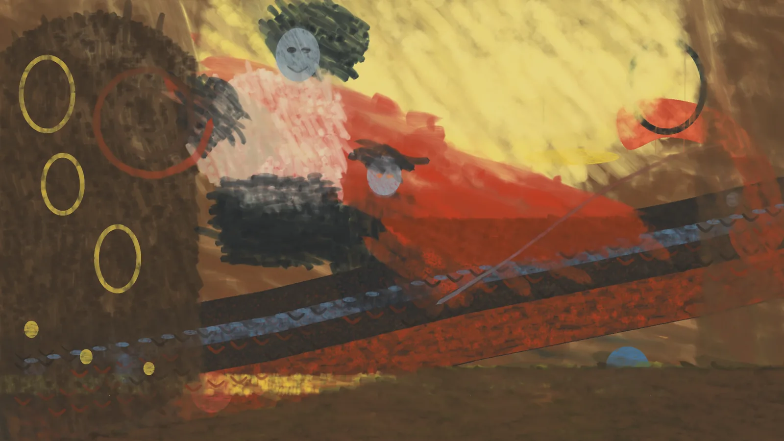
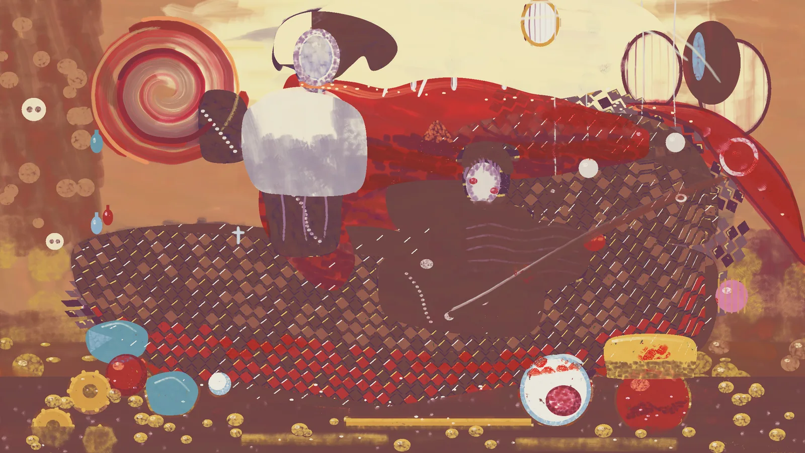
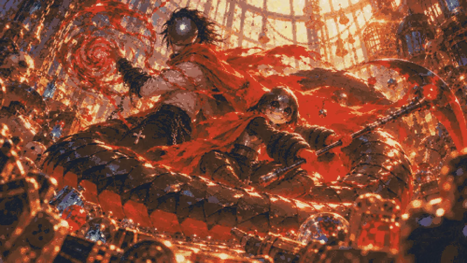
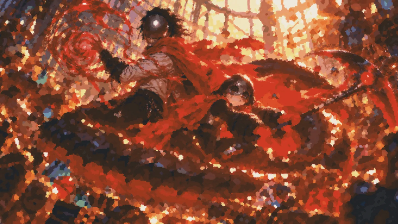
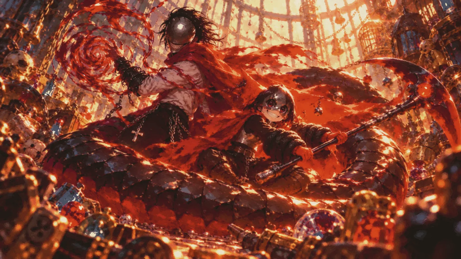
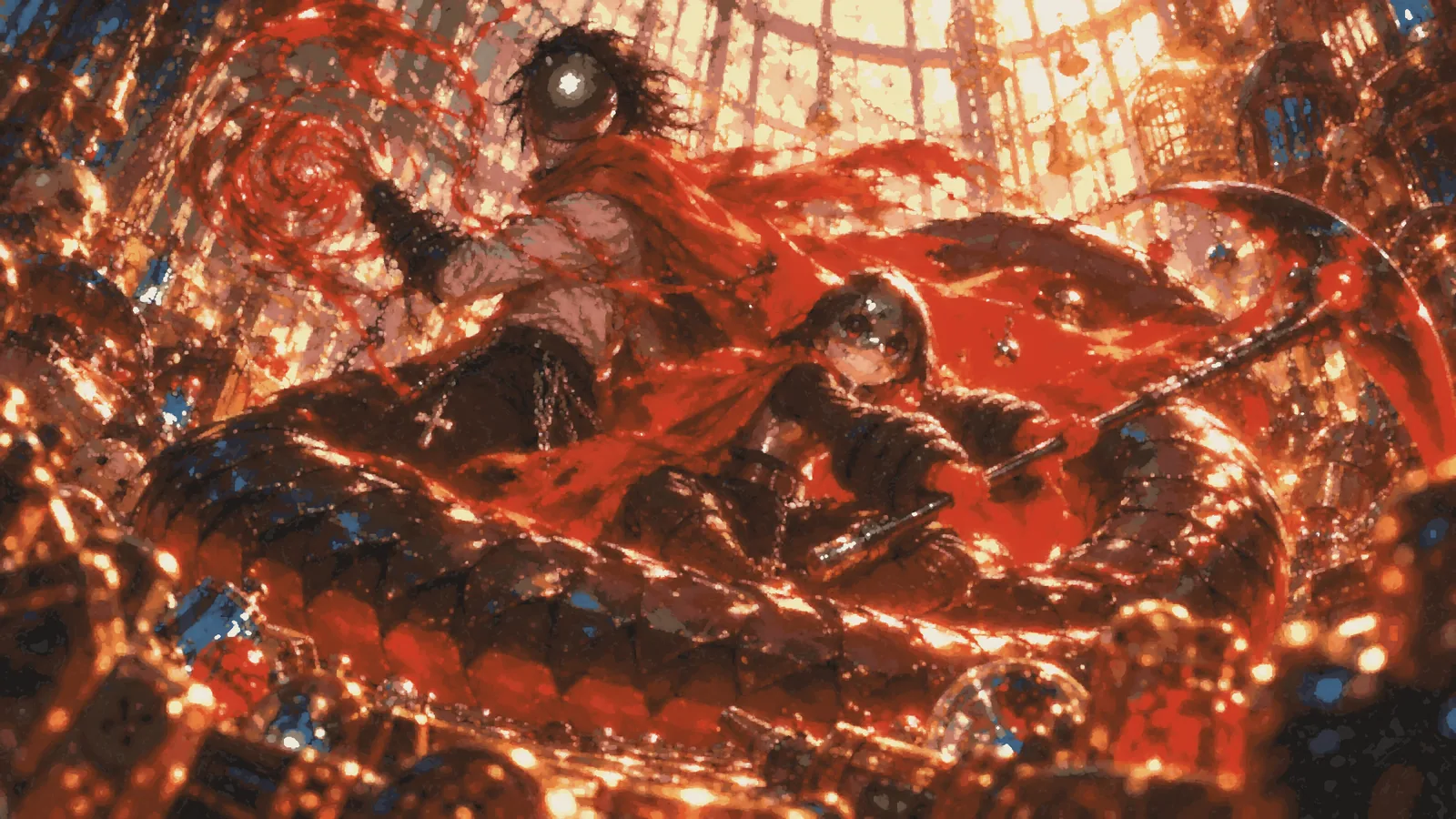
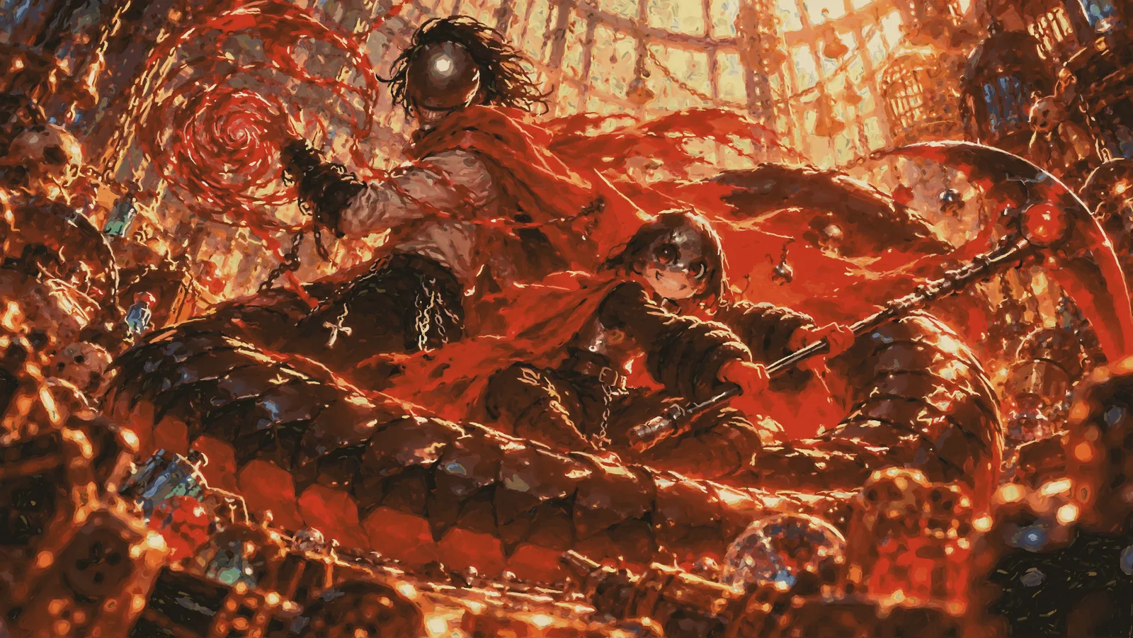
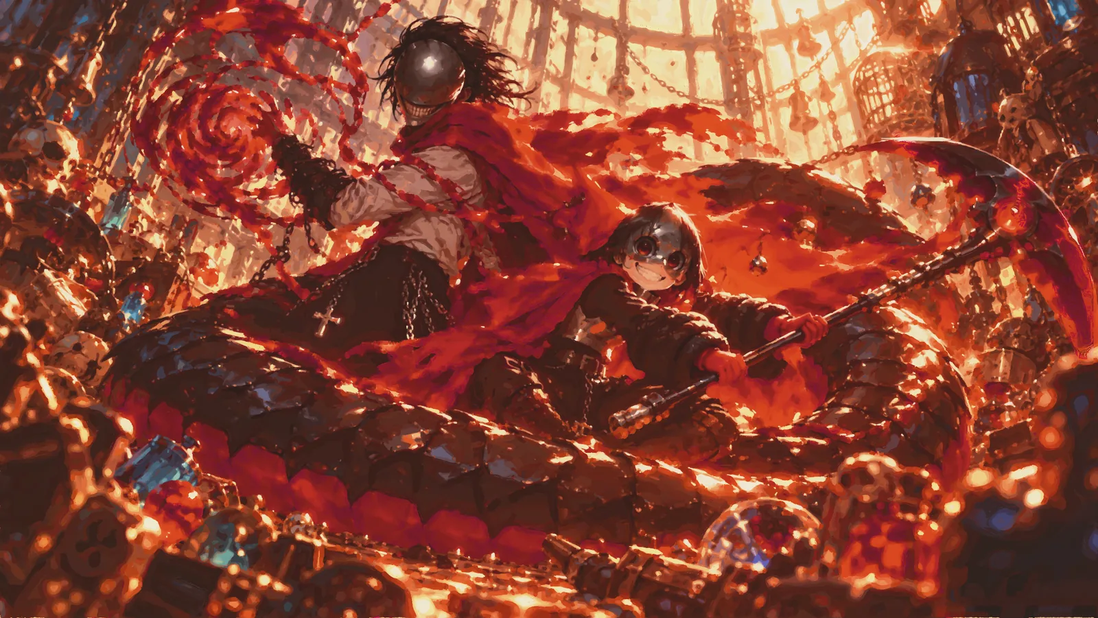
The split is right there in the grid. Six of them look like the picture. Three don’t. And my two favourite results from the whole experiment are one from each side.
The first tries, painted by eye
Every first try from the low and medium sessions worked the same basic way: read the guide, look at the picture, and write Lua that paints shapes where things are. A dark ground, a glow, an ellipse for a head, a polygon for a cape. Nobody measured anything. This is my favourite image of the whole experiment, Opus medium’s first try:
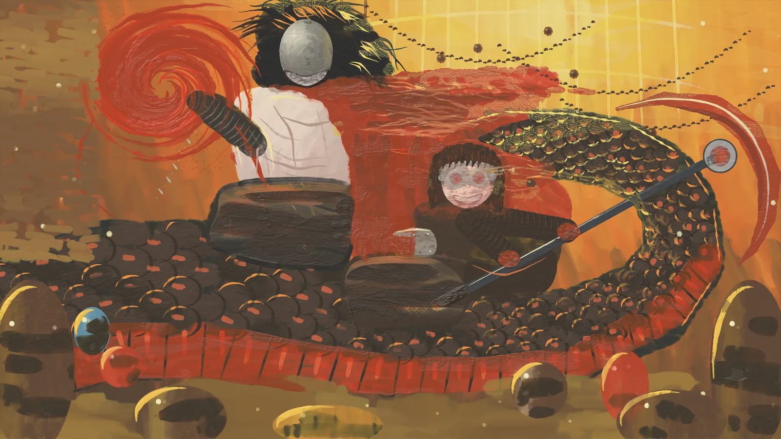
It genuinely feels like art to me. It looks like what a student would paint in their first month of oil painting: the serpent became rows of round scales because scales are round, the treasure became lumps, and Jefrie became a round face with ringed eyes and a big grin. It transformed the picture instead of copying it, and every one of those changes is a decision you can read.
The others, all first tries painted by eye:
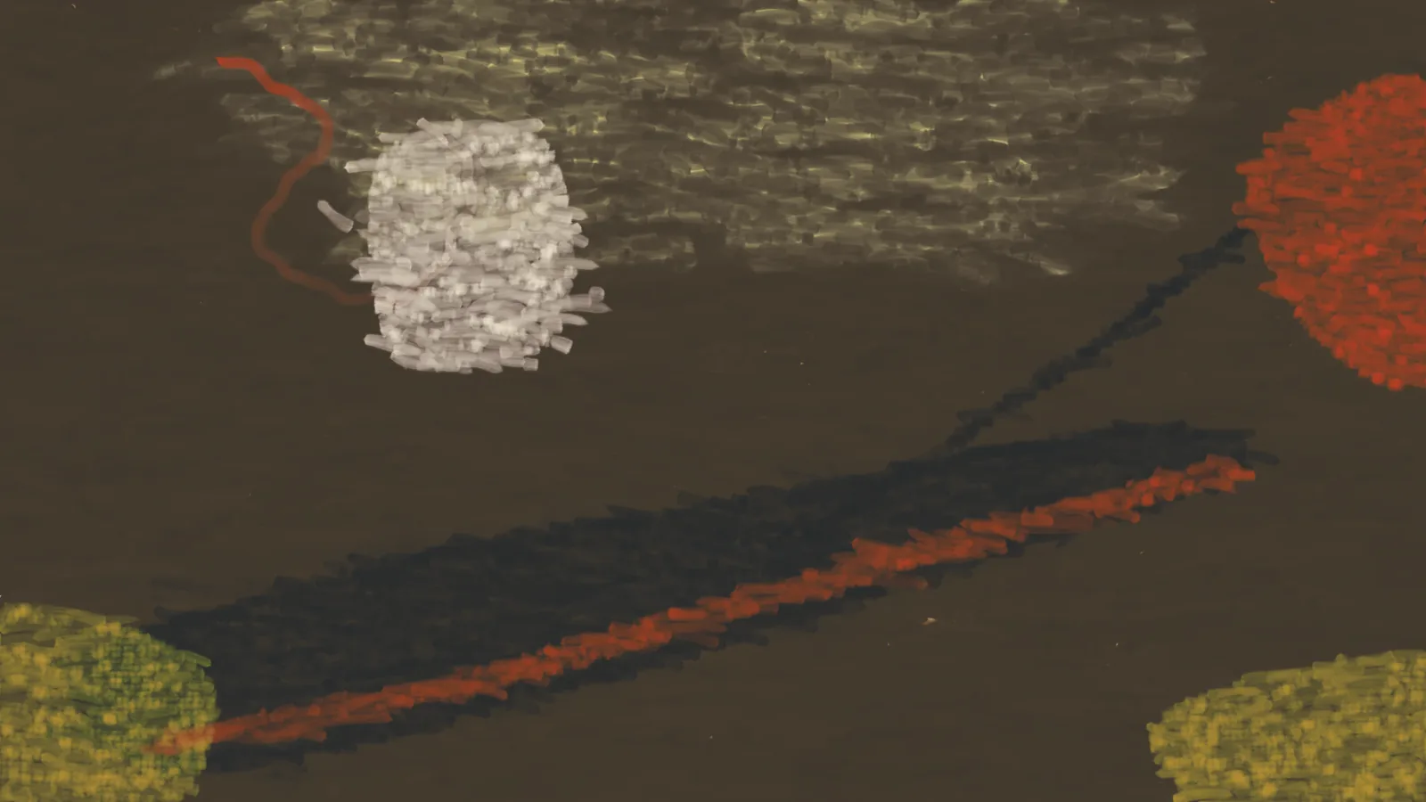
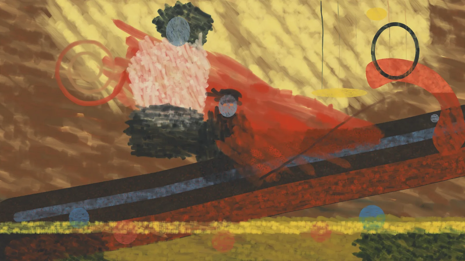
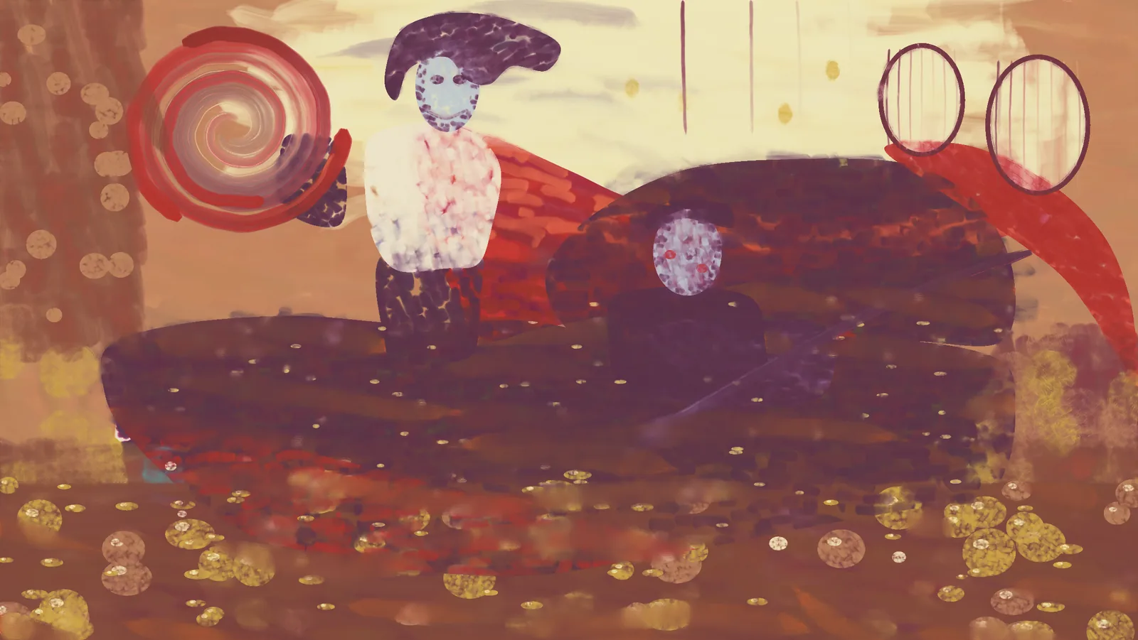
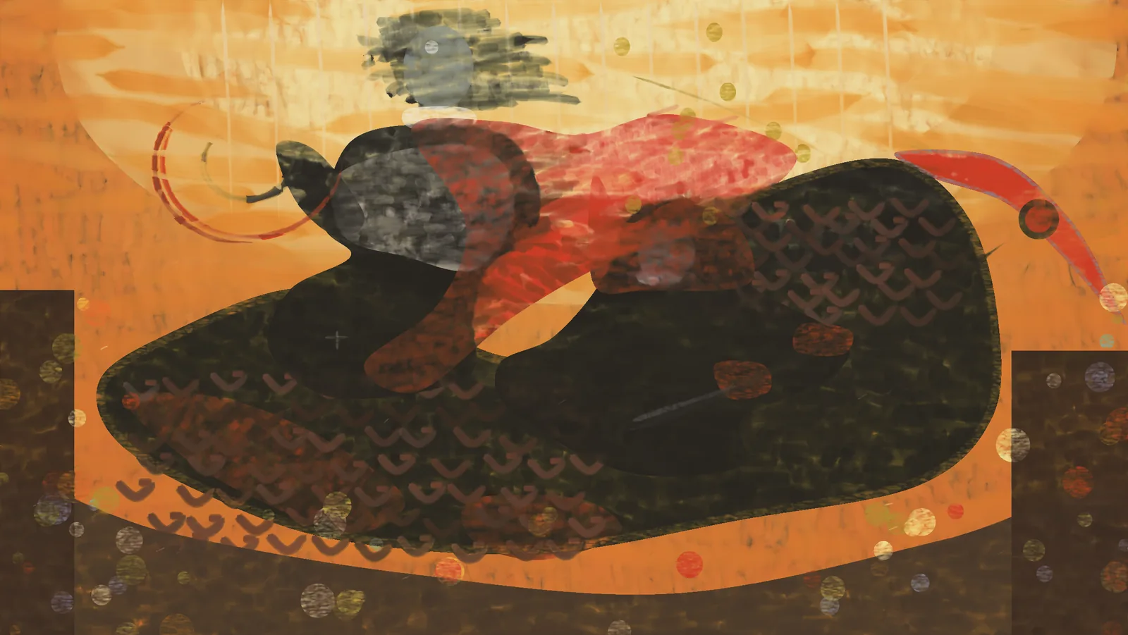
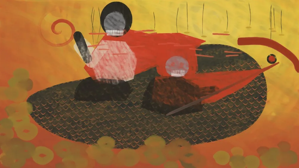
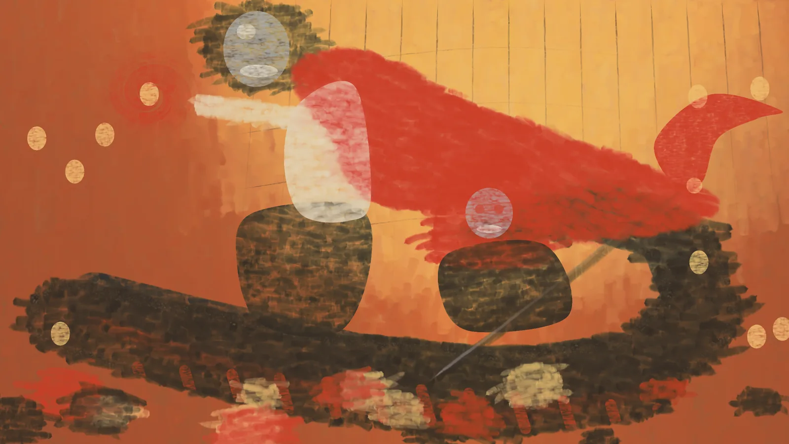
Every model was hard on these. Haiku low called its second version “a rough study” and named its own problem: “I’ve been placing big masks and then checking the look, which produces blocks rather than forms.” It said the next pass should go figure by figure with a pencil sketch first. That’s the right diagnosis, and none of them did it.
Haiku never left this mode. Even at max effort, with 67 chunks and about 86 hours of simulated brush time, it painted by eye the whole way through, so its result is the least like the picture and the most like a painting someone decided on: diamond-tiled scales, jewels as glossy balls, a swirl like a target.
The second tries: measure everything
When I asked for ten times the effort, almost everything changed. Opus low put it plainly: “I’ll calibrate how each paint mix appears on canvas, then match regions of the reference image to the closest mix.” Three of the five sessions that got that message (Sonnet medium, Opus low, Opus medium) rebuilt the painting around the same idea, and so, without being asked, did Sonnet low and two of the max sessions:
- Paint a colour chart first. Mix test patches from the tubes and measure what each one actually looks like on the canvas. Opus low made 160, Opus medium about 540, Opus max wrote a model of the engine’s own pigment mixing and checked it against 40 swatches.
- Match the picture to real paint. Opus low grouped the reference’s colours and found 29 mixes for them, at an average colour error of about 8 (around 2 or 3 is a just-visible difference). Sonnet medium, for every cell, found the pair of mixes whose blend came closest.
- Follow the edges. Work out which way edges run in the picture so the strokes follow them.
- Coarse to fine, drying in between. Big brushes for the masses, let it dry, smaller brushes, let it dry, and so on down to the highlights.
Opus medium went furthest: about 900,000 strokes, brushes from 10 canvas units wide down to 0.4, each stroke placed only where the canvas still differed from the picture, re-measured before every layer, with about 61 years of simulated painting time once all the drying waits are added up. It got the average colour error down to about 5.9.
That’s why these look so much like the reference. It’s also why they’re less creative. A painting that is steered toward the picture stroke by stroke copies its errors too: the crunch, the noise, the treasure pile that never quite resolves into objects. ChatGPT’s mistakes survived the trip into oil.
Not all of it was mechanical, though, and the differences between them are where it gets interesting.
Sonnet low never got a second message, and still made three versions. Its first layered script went wrong (“the snake paint covered the cape and figures”), so it started over, then started over again. Its third version laid paint as a grid of small square dabs, so up close it reads almost like pixel art. Here it is building up, and the replay it made when I asked:
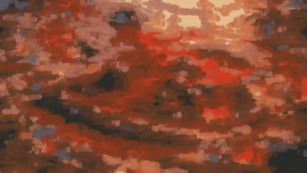
Sonnet medium made the most beautiful middle stage of the lot. Its first underpainting mixed 25 piles per brushload, which muddied every colour and gave a soft, dreamlike smear. It let that dry and laid a mid-scale pass of mostly single-colour strokes over it, and that pass, before any detail went on, is a painting I’d happily stop at. It looks like a confident painter’s lay-in, and it shows the method better than any finished version does:
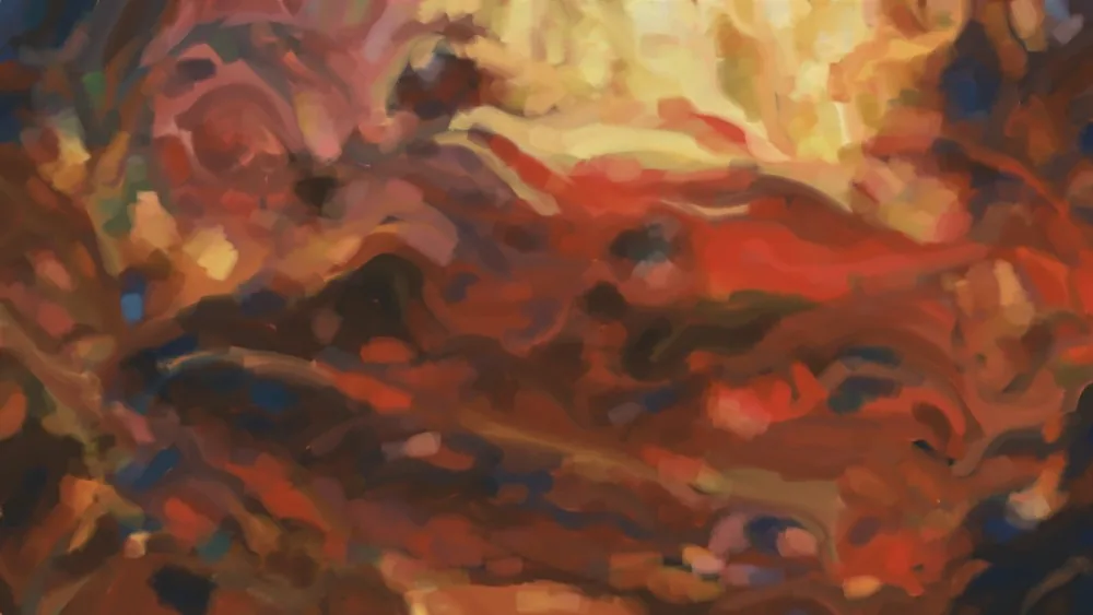
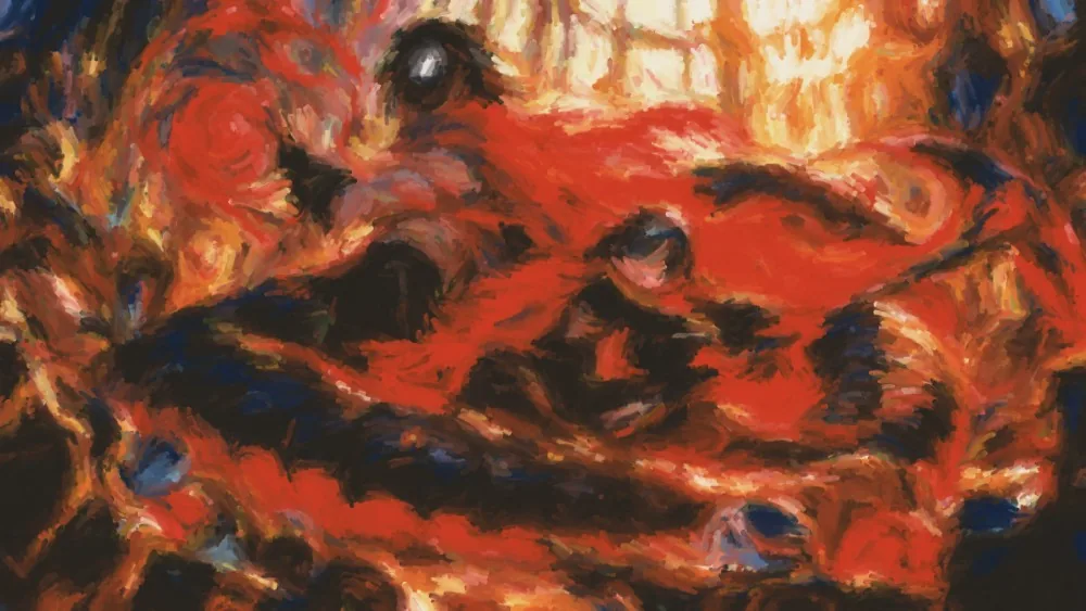
It went on to 114 chunks, with each colour region painted through its own mask and a finer pass on the two faces, the scythe head, the swirl and the shirt. Some chunks hit the easel’s 10-minute limit and were lost, so it split the work smaller. It called the result “a coarse mosaic of paint dabs”, which is fair.
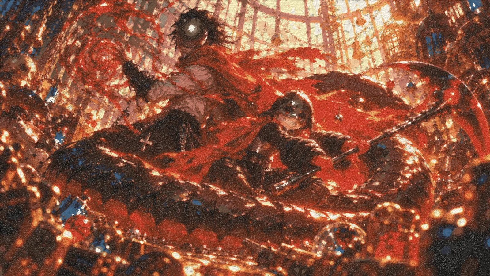
Sonnet max did something I didn’t expect. Before it painted, it found a note in the repo warning against per-pixel colour fields taken from a photo, the “digital look” the simulator exists to avoid, and said it would work like a human copyist instead, reading positions off a ruled grid. It also swapped the default 14 tubes for the full pigment box, for the cadmium reds and Indian yellow. By the end it had laid about 400,000 strokes over 148 hours of hand time, and its own description of the time-lapse is “the fine-detail passes sharpen the picture in bands across the canvas”, grouped by paint mix to save trips to the palette. Whatever it meant to do, it ended up with the same machine as the others.
Opus low and Opus medium both started their second versions on a fresh canvas rather than painting over the first. Opus low said why: “the crude shapes from version 1 would have shown through anything I put on top.” Both also hit the same wall, which is that this tube box has no crimson. The reds run orange, and Opus medium tested that glazing over them can’t push past vermilion’s own hue. Opus max, which used the full 54-tube box, is the only one whose reds go properly deep.
Opus medium also painted Jefrie’s face by hand at one point, didn’t like it (“a flat cartoon”), and wiped it off with a solvent-dipped rag while it was still wet. And its teeth wouldn’t appear: its planner looked at the picture at one pixel per canvas unit, which blurred the teeth into the gaps between them, so it re-analysed the faces at two and three times the resolution.
The gallery renders below are the same paintings lit from above, as they’d hang on a wall, so the ridges of paint catch the light:
Painting over the whole thing
Sometimes a model didn’t like what it had and just painted over it. That defeats the purpose of everything underneath, and it’s exactly what people do. Haiku max’s time-lapse shows it best. About 50 seconds in, it has spent hours tiling the serpent with diamond scales, and then it covers the whole serpent in a flat dark green and starts again. Haiku medium did a smaller version: a glow pass painted over BloodTailor entirely, so it rebuilt him from his old positions.
That’s also the only time-lapse that shows the clock. Haiku stamped every frame with the chunk being painted and the hand time so far. I wish they all had. The replay skips the drying: Haiku max’s painting took about 86 hours of brushwork and roughly 300 days of letting paint dry, and the video only shows the brushwork. Most of the models used that. They worked in layers, let each one dry, and started each layer with basic shapes, ending with fine detail.
The printing press
Watching these, one thing bothered me. Almost every model put the same amount of effort and detail into the entire image. They painted like a printing press: choose how many passes, choose a brush size per pass, and run that brush over the whole canvas, band by band. The face gets the same treatment as a blurry jewel in the corner.
That’s a very machine way to paint. A painter puts the detail where the eye goes, here the faces and the weapons, and lets the background and foreground stay loose. And they pick a brush for what they’re painting, not one brush for a whole layer.
Opus max is the one that broke the pattern, at the very end. Its time-lapse labels every stage, and they read like this:
| Stage | Brush | Strokes |
|---|---|---|
| 1 · lay-in | filbert 30 | 2,952 |
| 2 · masses | filbert 17 | 5,993 |
| 3 · forms | filbert 9.5 | 14,203 |
| 4 · drawing | filbert 5.5 | 45,600 |
| 5 · detail | filbert 3.2 | 97,385 |
| 6 · fine | pointed round 1.9 | 175,003 |
| reds restated | filbert 2.3 | 94,027 |
| faces | round 1.3 | 27,747 |
| blade, gem, hands | round 1.6 | 32,608 |
| glints | thick white touches | 1,106 |
| deep crimson glazes, varnish | ||
| finished | 496,624 |
The first six stages are the printing press: one brush per layer, smaller each time, everywhere. Then it stops and goes after specific things: the faces with their own small round brush, the blade and gem and hands with another, a thousand thick white touches for the glints, and glazes to deepen the reds. I was really happy to see that. This is my other favourite result, the full two and a half minutes:
Drag the divider to compare it with the ChatGPT image:
Jefrie’s face, up close
This is where it feels wonderful to zoom in. Here is her face in the reference and in Opus max’s painting, at the same framing:
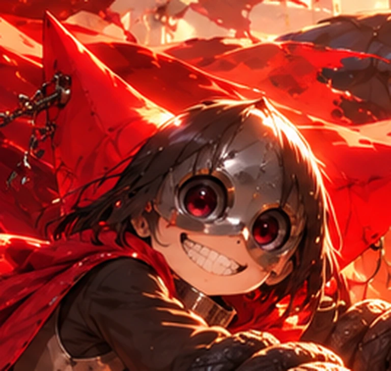
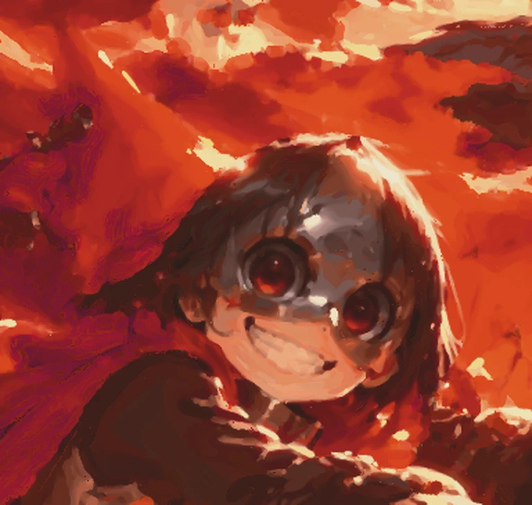
It kept nearly everything: the mask’s shine, both red eyes, the grin, the gorget at her neck, the hair falling over the mask. What it couldn’t keep is the crispness. The reference’s highlights are hard, bright and clean, and oil paint laid in brushstrokes softens every one of them. The teeth are a row of cream dabs. That’s the medium as much as the model, and it makes me want to try others.
And the same face across the others:
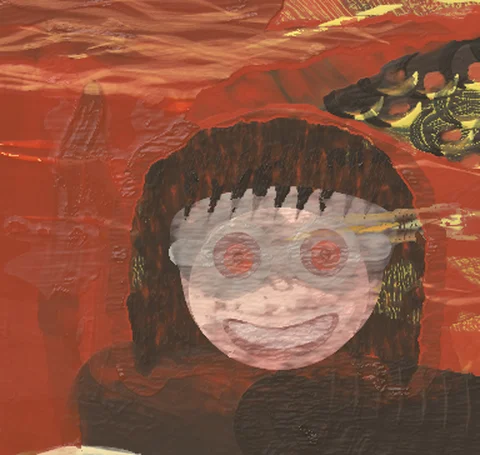
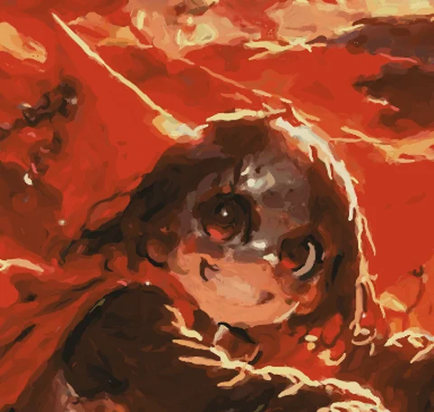
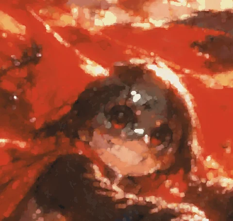
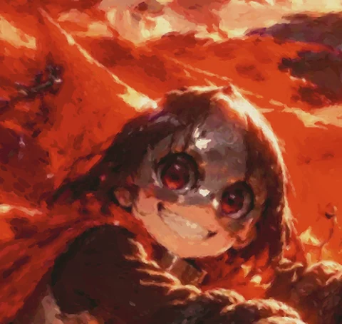
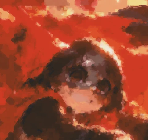
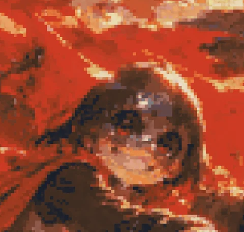
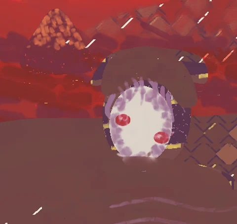
You can see each method in a few square centimetres: Sonnet low’s grid, Sonnet medium’s
mosaic, Opus medium’s traced line accents, Haiku painting the idea of a face. I think this is a
window into how the model thinks and sees. None of them knew who these two were; the
transcripts call them “the man” and “the child”, one session saved the file as
reaper-painting.png, and Sonnet low named its own hellsing_painting.png.
What I want to try next
- Measure for the shapes, then take the ruler away. Let it check against the picture for the lay-in and the masses, so the proportions are right, and then forbid it for the details. I want to see what the model comes up with for the details on its own. That’s where Opus medium’s first try came from.
- Opus max, by eye only. Same model, same effort, but told it may not verify against the reference with a script. It can only look.
- A forced process. The entire background first, then the characters on top, then details, then highlights.
- Detail where it matters. Ask Opus to zoom into the faces and spend its resolution and effort there specifically.
- A new picture, not a copy. The same two characters in the same place, but a different camera angle and pose. Then there’s no reference to copy from, only to learn from.
- Other media. Oil can’t hold the crisp highlights this picture is built on. I’d like to see what it does with something that can.
The resolution problem
We also found that going above the current size is hard. The easel paints every painting at 2400 pixels wide, and it simulates every pixel of paint: wetness, thickness, what’s underneath. A full-canvas pass takes minutes of CPU, and Opus medium’s last full-canvas sharpening pass was about two hours on its own. Doubling the width is four times the pixels.
I’d like to find a way around that. A few ideas I haven’t tried:
- A second, finer canvas just for the faces, painted on its own at high resolution and set into an enlarged copy of the whole. The risk is a seam, and brushwork that suddenly changes scale.
- Tiles. A brushstroke only touches the paint near it, so a big canvas could be cut into overlapping tiles, each painted by its own session at the same time, then joined.
- Resolution where the brush is small. Simulate the background coarsely and only the passages with fine brushes at full resolution. That needs a change in the simulator itself.
Any of those would let the detail go where the eye goes, which is the same lesson as the printing press, just for pixels instead of strokes.